E-Commerce UX Experiments at Colony Brands
At Colony Brands, I worked as a Web Designer (UX/UI Designer) creating responsive layouts, campaign content, and e-commerce flows across multiple brands. Beyond production work, I partnered with stakeholders to test UX improvements in navigation, cart, and category flows. These experiments balanced user needs, business goals, and executive preferences.
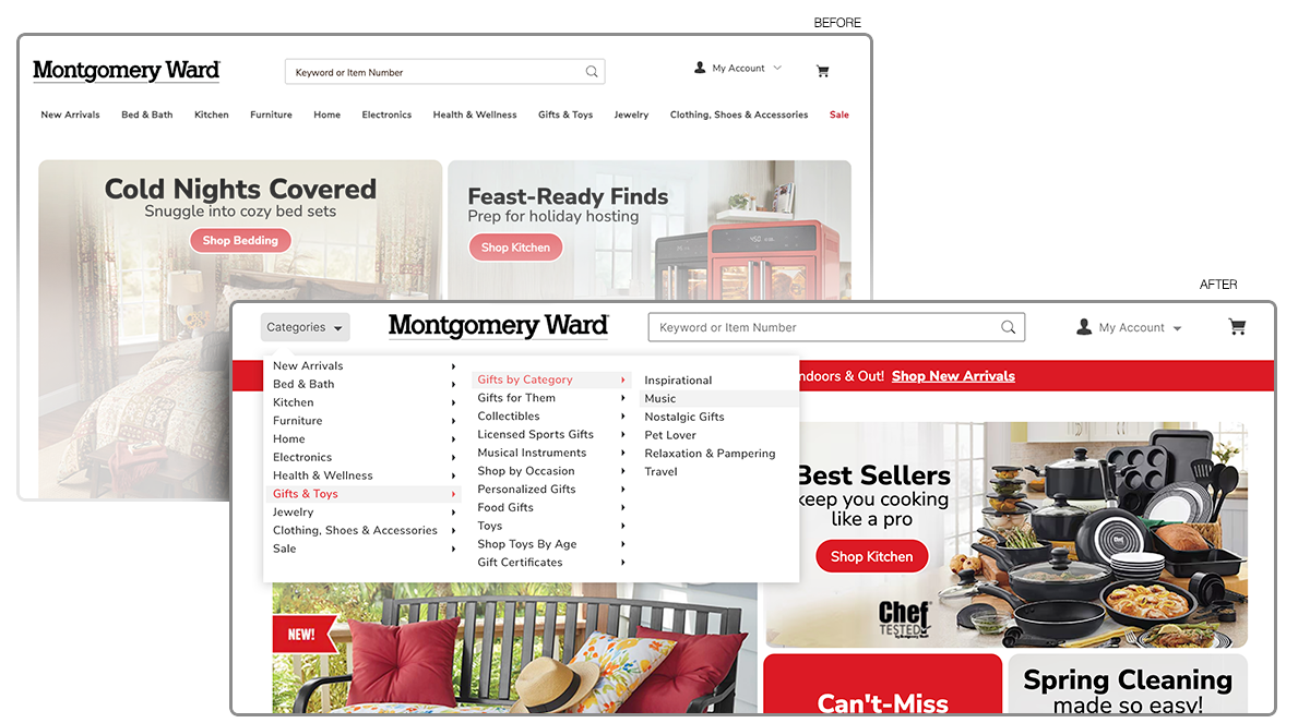
Experiment 1: Experiment: Alternate Navigation Placement
Challenge: The existing navigation sat below the logo and search, pushing the hero modular section further down the page and limiting above-the-fold visibility. Leadership wanted to test ways to optimize fold space while considering alternative navigation patterns.
Process: (Explored multiple variants)
• Moving the full nav inline with the logo and search to lift the hero section higher.
• Collapsing all nav into a single “Categories” dropdown (big-box style).
• Hybrid solution: keeping key featured categories visible, with the rest nested in a dropdown.
Personally evaluated trade-offs — while full dropdown freed space, it risked hiding primary categories and reducing engagement.
Outcome: Produced test-ready designs balancing business goals (more above-the-fold hero visibility) with usability concerns (keeping top-level categories visible). Recommended hybrid approach as the most user-friendly compromise.
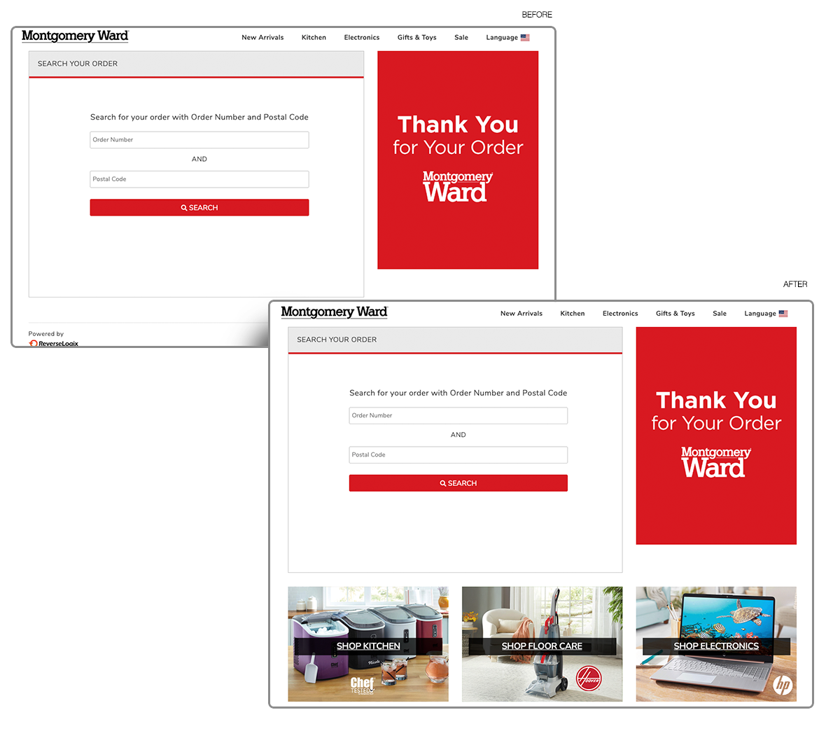
Experiment 2: Driving Conversion with Smarter Order Search
Challenge: The “Search Your Order” page only allowed users to enter an order number and postal code. Once completed, the experience ended — there were no opportunities for continued shopping or engagement.
Process: I proposed a redesign that added clickable product categories alongside the search input. This created a secondary path for users to discover new products, turning a purely functional page into an opportunity for cross-sell.
Outcome: The mockup introduced shopping ideas post-purchase, aligning with business goals of increasing repeat sales while still supporting the original order-tracking function.
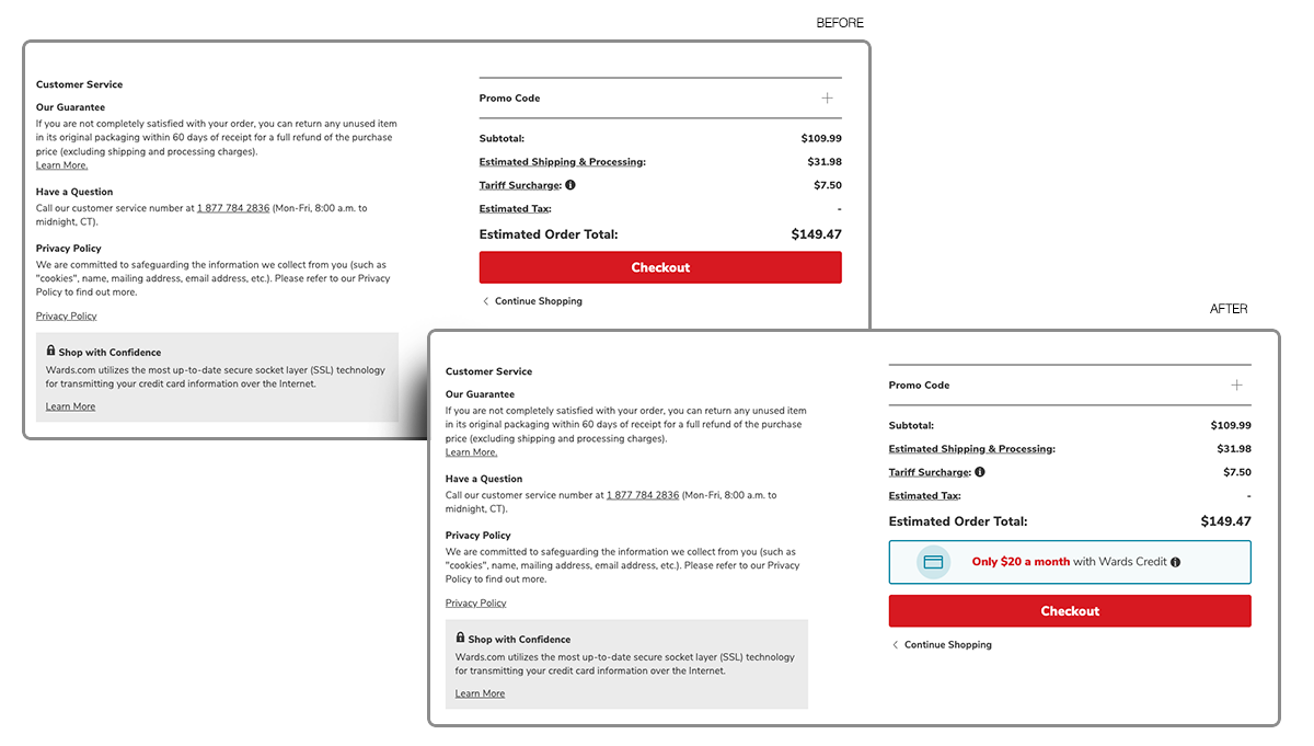
Experiment 3: Checkout Flow Optimization
Challenge: Finance team wanted more credit applications; risk of clutter in cart.
Process: Placed “Apply for Credit” CTA near checkout button.
Outcome: Created new conversion opportunity while monitoring for potential drop-off.
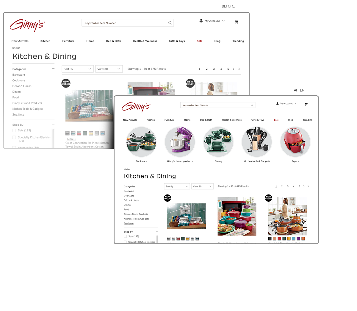
Experiment 4: Improving Product Discovery with Category Icons
Challenge: Category navigation lacked visual anchors; stakeholders wanted images but not lifestyle photography that cluttered layouts.
Process: Designed clean, product-only icons on neutral backgrounds to improve clarity and consistency.
Outcome: Delivered a modern, scannable look that improved recognizability and created a consistent system across brands.
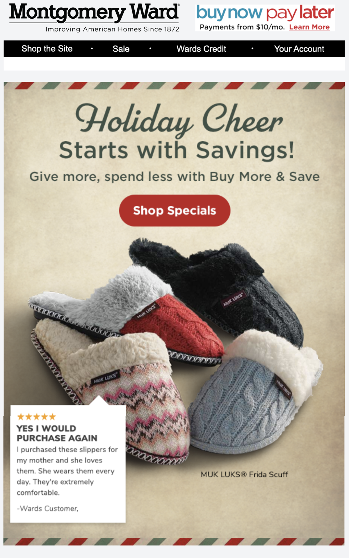
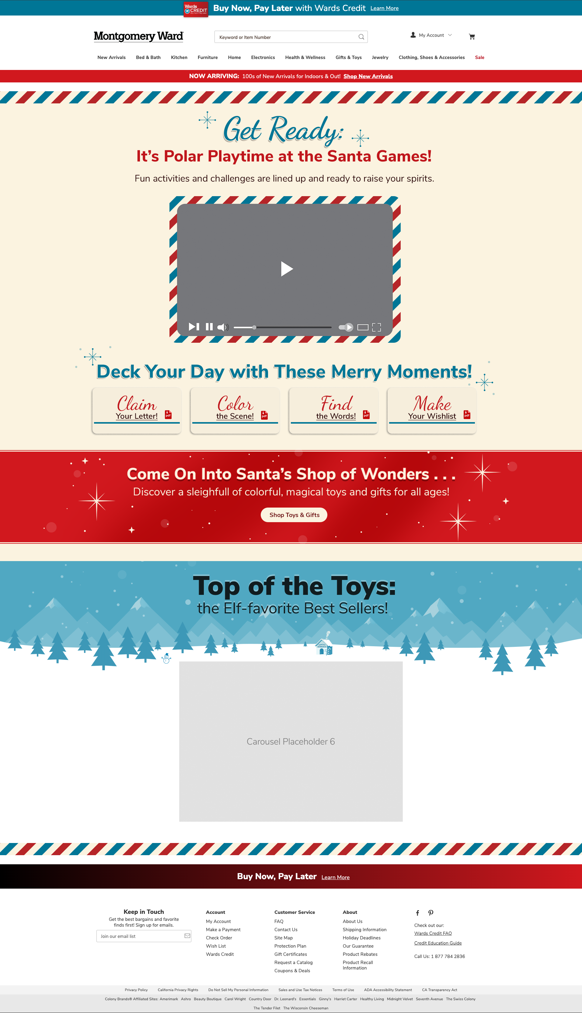
Holiday Campaign Landing Page (Live Initiative)
Challenge: Seasonal holiday pages needed to drive conversions across multiple brands while staying consistent, responsive, and accessible, all under tight deadlines.
Process: Designed modular page layouts that balanced strong visuals with ADA-compliant text, ensuring clarity across desktop and mobile. Collaborated with marketing to align design direction with campaign strategy.
Outcome: Delivered live holiday pages that reinforced brand identity, improved accessibility, and created scalable templates for future seasonal campaigns.

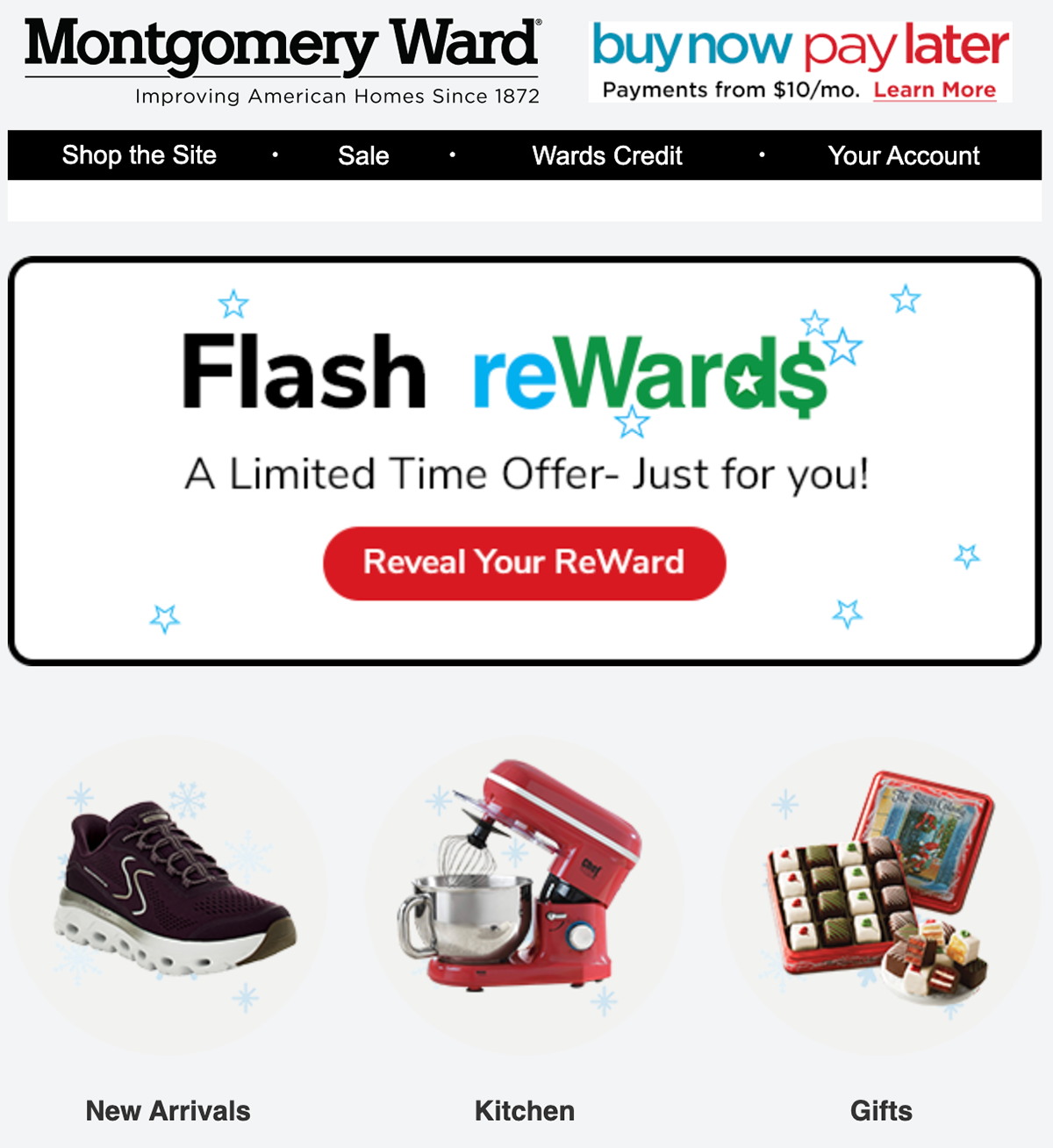
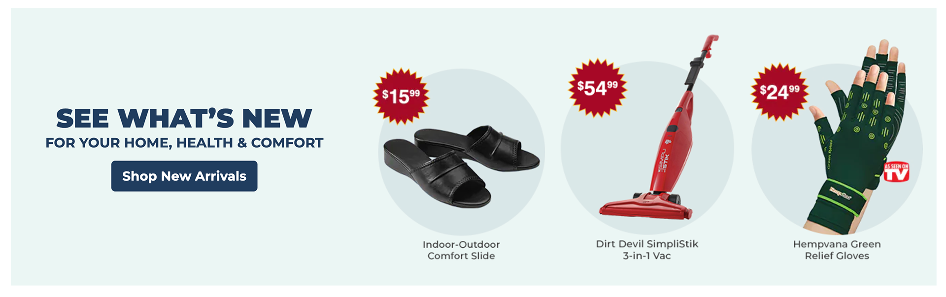
Email Campaign
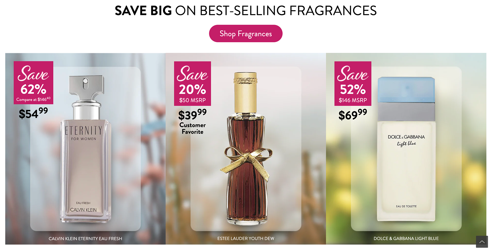
Website Campaign

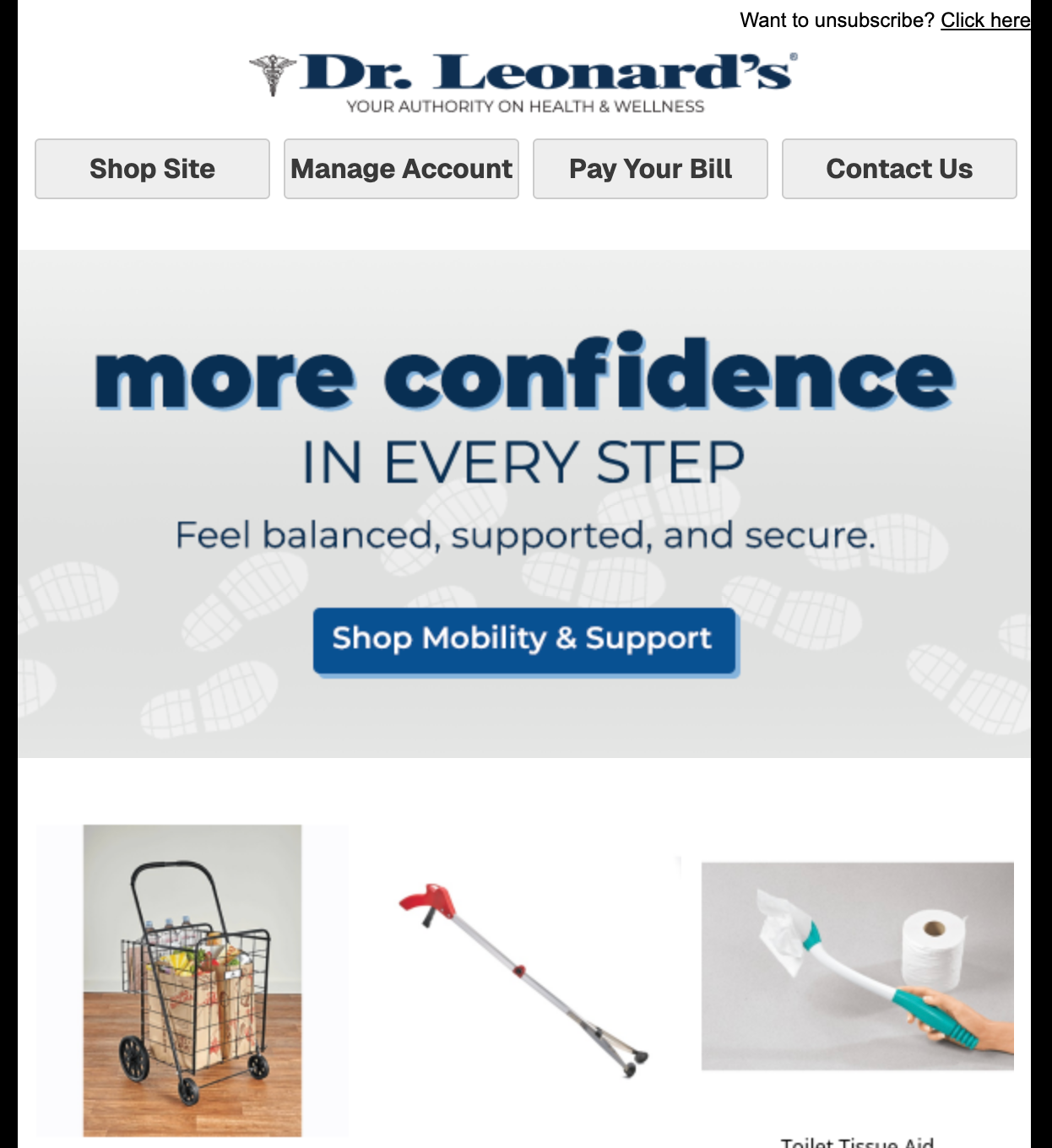
Website
Website
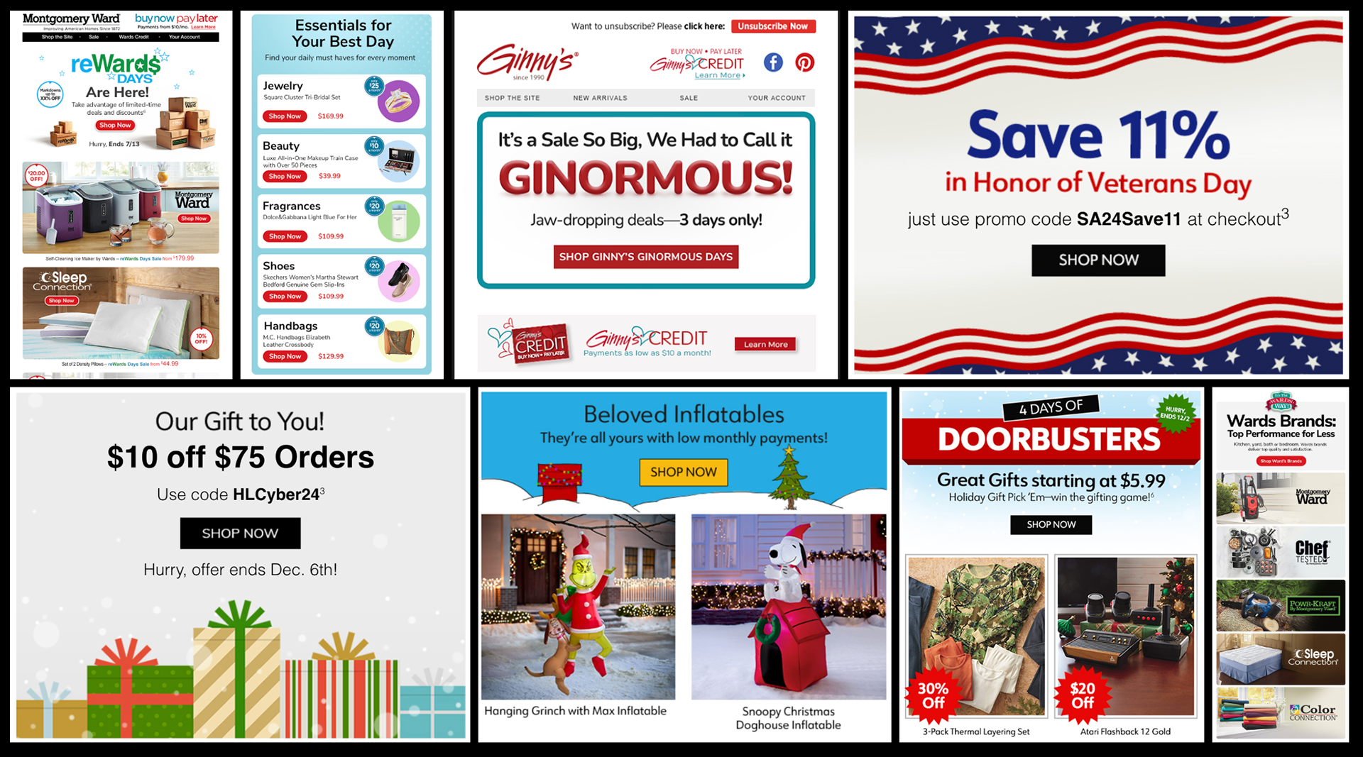
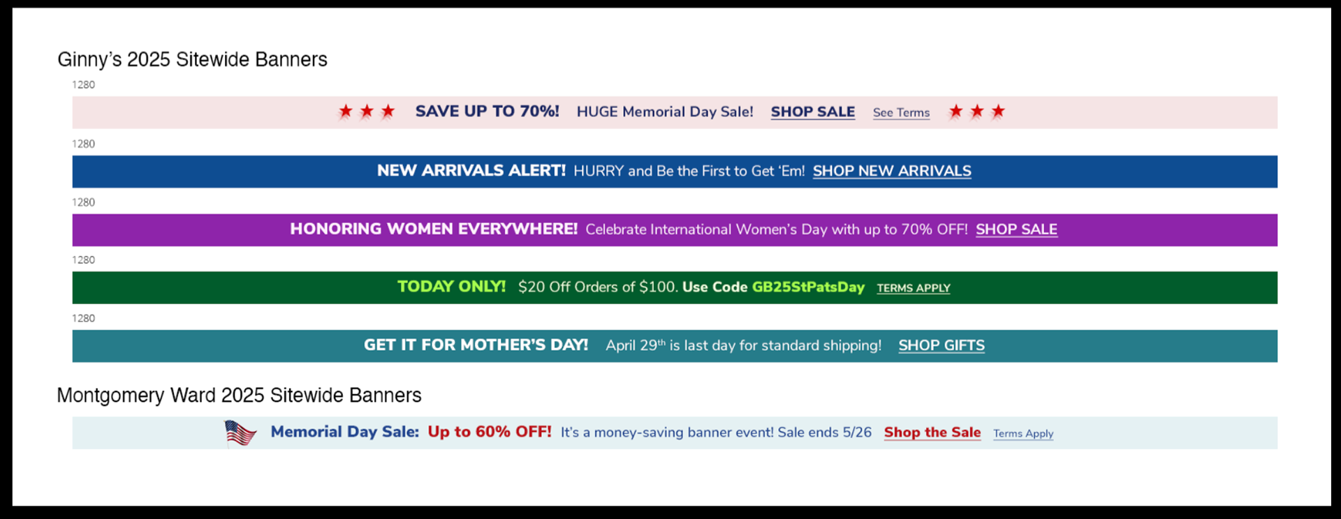
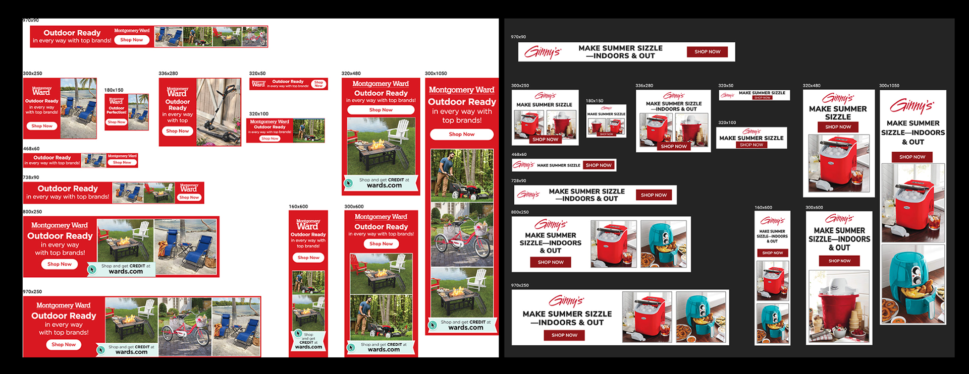
Site Wide Banners